

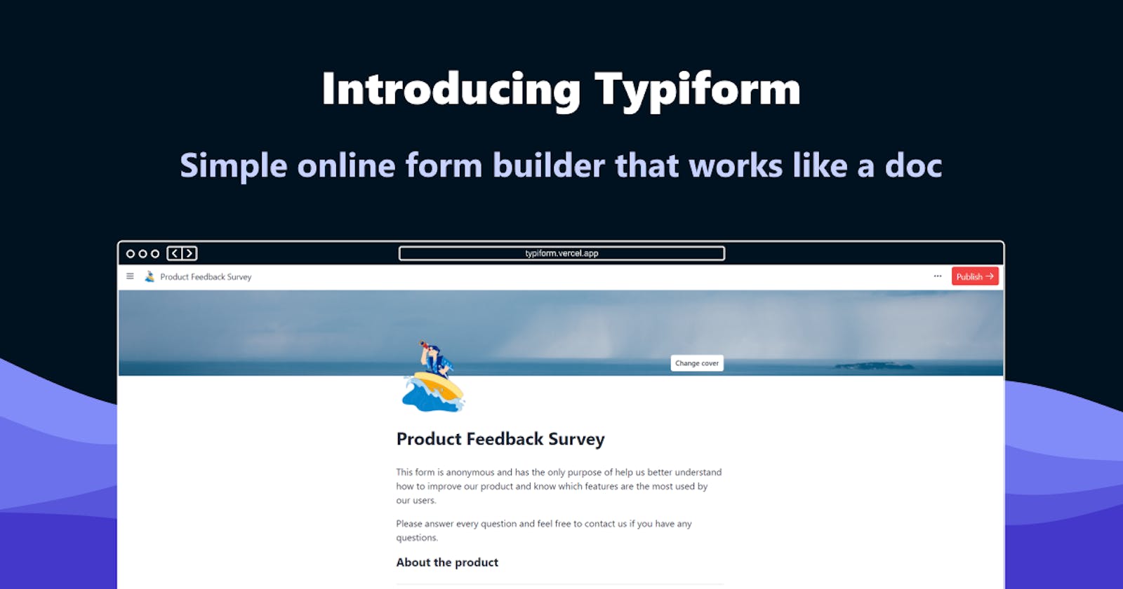
🌟 Introducing Typiform: Simple online form builder that works like a doc
The making of Typiform (Prev. Foma) for Auth0's Hackathon


Hi there 👋
I'm back writing my second post here on Hashnode and presenting a complete refresh of my previous project with some new features and brand-new UI and name.
📝 Change log
Here is a quick breakdown of the changes added from previous version:
- Renamed from Foma to Typiform
- Added customization options with font typefaces, cover images, and icons.
- Added new block elements such as section titles, email, calendar, phone, and link addresses.
- Added user authentication with Auth0.
- Complete codebase rewrite to Next.js with Typescript
What is Typiform?
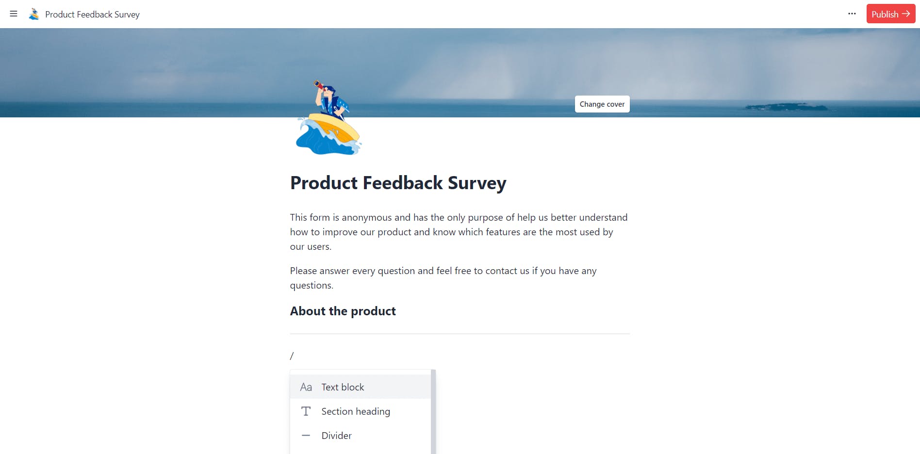
Typiform is the simplest online form builder which you can use as easy as if you were editing a document. It is inspired by how Notion works (and look) so you can start adding form elements by triggering the command popover, just type / at the beginning of a text element.
You can add as many blocks as you want and customize the look of your form by selecting a font typeface, changing the font size, or selecting a wider layout.
🧠 Idea
We all have used Notion or at least have heard of it, this project emerges by trying to build an app like Notion, and what can I first thought was to make a form builder. Most of the form builders out there are the drag and drop ones, but using the mouse takes time and it's boring. The idea was to make something that could be used with the keyboard, and it should be easy to use like editing a document.
Here's a 3 min. video making a form! (Play it in 2x 😅)
💻 Built with
Main stack used
- Next.js for the frontend UI
- HarperDB for database
- Auth0 for user authentication and account management
- Vercel for deployment and serverless functions
- Tailwind CSS for UI styling
- Jotai for app state management
Code quality
🛠 Design and Development
For the design process, as it was an app inspired by an existing one, I jumped straight to writing code and designing in the browser. But before this I first thought of what components would be needed for this app.
From the notion app I extracted the following components which I could use into my app.
- Sidebar
- Editor Navbar with customization options
- Header icon and cover image
- Command popover with filtering options
After extracting those components, I first started by working on the form creator page, as it is the most complex part of the app.
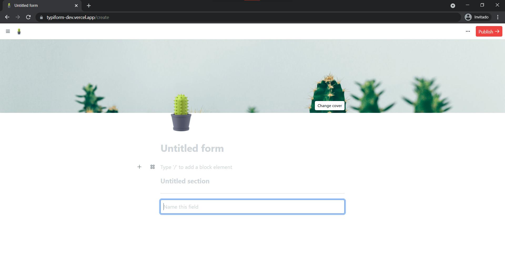
The creator page has all the complexity of this app inside, it's the core feature. From there you can create a new form, set its styling options, set an icon, and cover image, and add the form blocks.
Each of these elements are managed by a global state using Jotai, which is a state management library similar to Recoil, the form title is stored on its own state, the icon and cover are stored as object values on a header state, as well as styles. Finally, the blocks state is the one where all the form blocks are stored and updated with the selected block properties.
🖼️ Unsplash
For the header element I wanted to integrate the Unsplash API so the user can search and select a cover image from a large library of stock images.
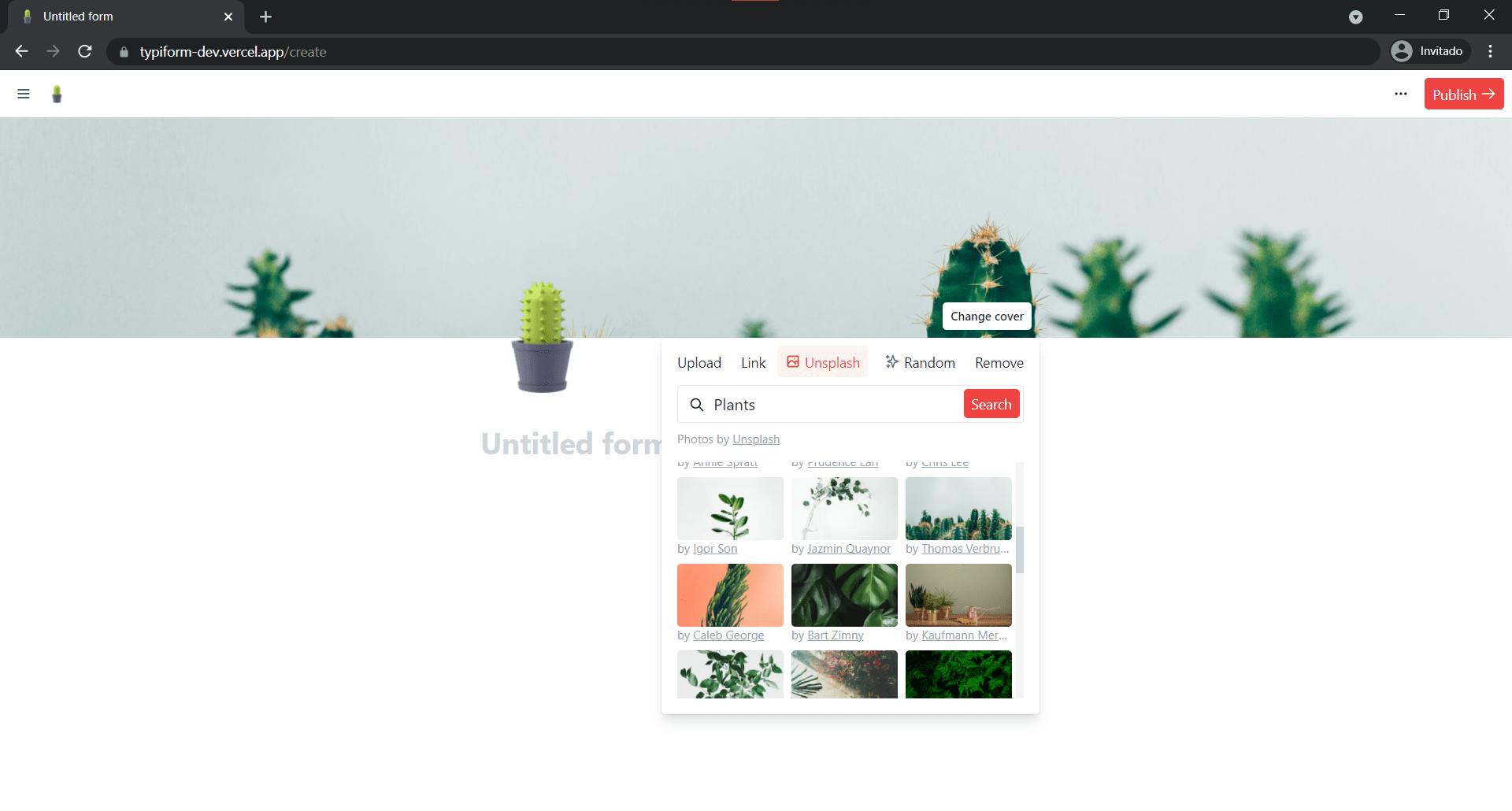
For the Unsplash integration I used a react-infinite-scroll-component which is especially useful to fetch data as the user scrolls so we can fetch more images without having to search again. Data is fetched through Next.js serverless api routes.
Accessible components
As I was working with Tailwind for styling, I also used the HeadlessUI library to create accessible components without too much hassle. It is a great option to build elements such as Popovers, Tabs, Modals, and more without worrying about aria properties and keyboard events. Recommend you try it for your next React project.
🧱 Blocks
Blocks are the core part of the app; the form elements are stored inside the blocks state as JSON objects. When I started with this app, I didn't know how to make a "builder-like" app, I first thought how will I store the elements, after many attempts to make a demo app (Foma), I ended up using JSON objects inside an array, each object was an element with its own properties, and I could easily update its values and render an element.
This is how a block element looks like:
{
    "tag": "p", // tag to render !required
    "label": "Text block", // label show on command popover !required
    "placeholder": "Type '/' to add a block element", // placeholder shown in editor to guide user
    "icon": "text.svg", // reference to icon for command popover !required, icons are stored inside ./public/img/icons/
    "props": {
      "className": "leading-normal py-1" // styling classes for the element, we can use any Tailwind utility as the blocks.json is also purged by Tailwind
    }
  },
With this structure now it's easier to create and add more blocks to the app. This way when the user changes an element, the app replaces its values and properties with the new one, and as we add more blocks it appears automatically on the command popover.
Then we render each element using the React.createElement() function and pass each block properties. Here's how it looks like for form elements.
React.createElement(block.tag, {
  // include all defined props in `blocks.json`
  ...block.props,
  // override the placeholder value for the one user specified while editing the form
  placeholder: block.value,
  // register the element for `react-hooks-form` event handling
  // if user did not specify a value, we register it as an "Untitled question"
  ...register(
  `${ block.value ? sanitize(block.value) : 'Untitled question' }`, { required: true }
  ),
})
When editing a block, the tag property is ignored and an editable div element it's rendered instead. This is because if the tag element it's rendered when editing, inputs does not expand its width as you type for example, we want to make the block editable and a div element styled to make it to look like the element it's easier. Also, we don't enter on complications when listening to input events, for p, div, or any other dom element the content it's stored on element.textContent but for Input or any form element it's on element.value.
Dashboard
The home of all your form data, it's protected with authentication but if you choose to share your responses page, everybody will be able to see your responses tab.
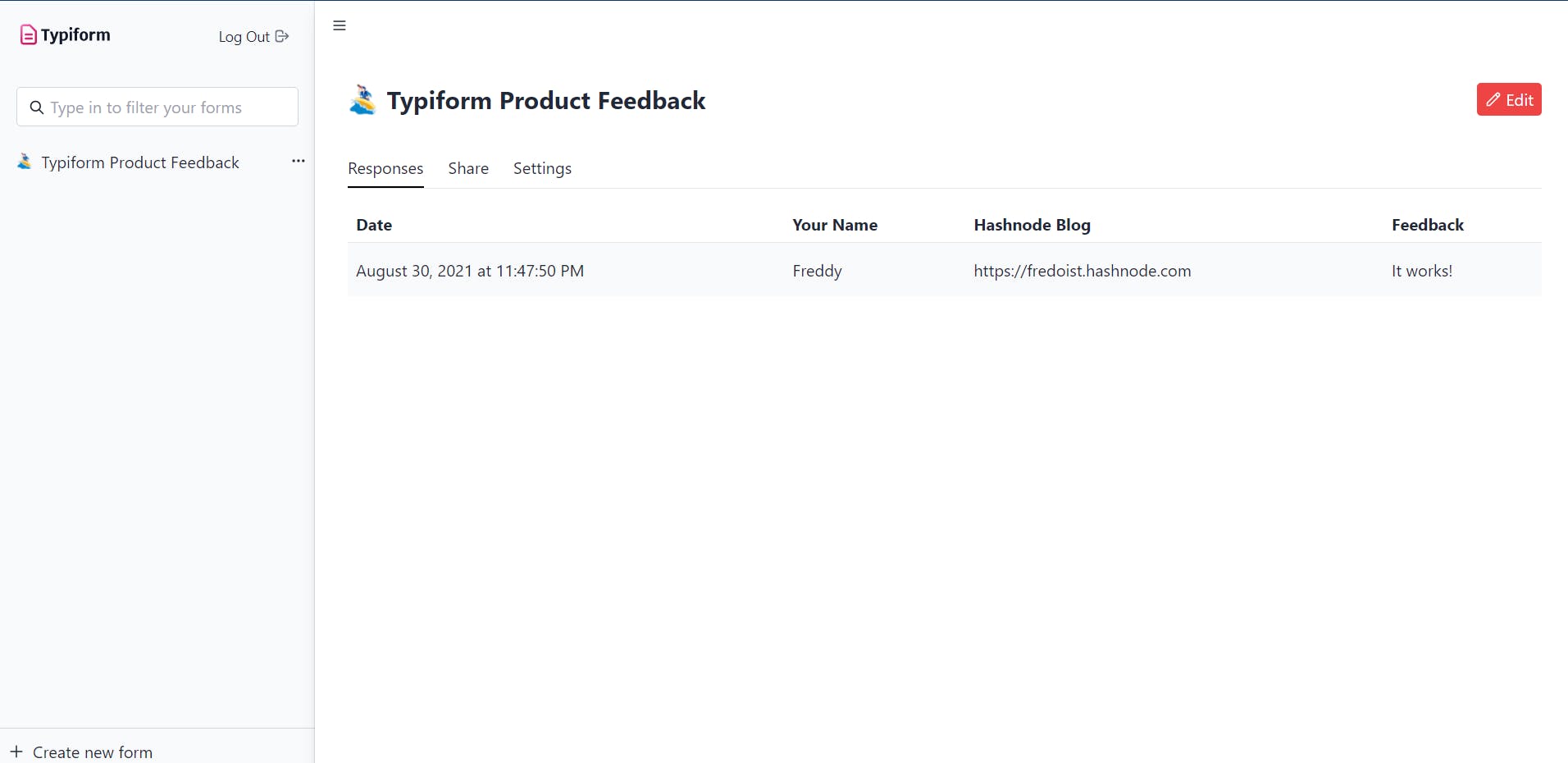
The dashboard is where you can see each of your form responses, it's primarily conformed by the sidebar where you have all your owned forms, and a tabs panel where you have the form details.
Form view
Finally, the form view, you don't require authentication to view a form and send a response, so feel free to share this URL with anyone.
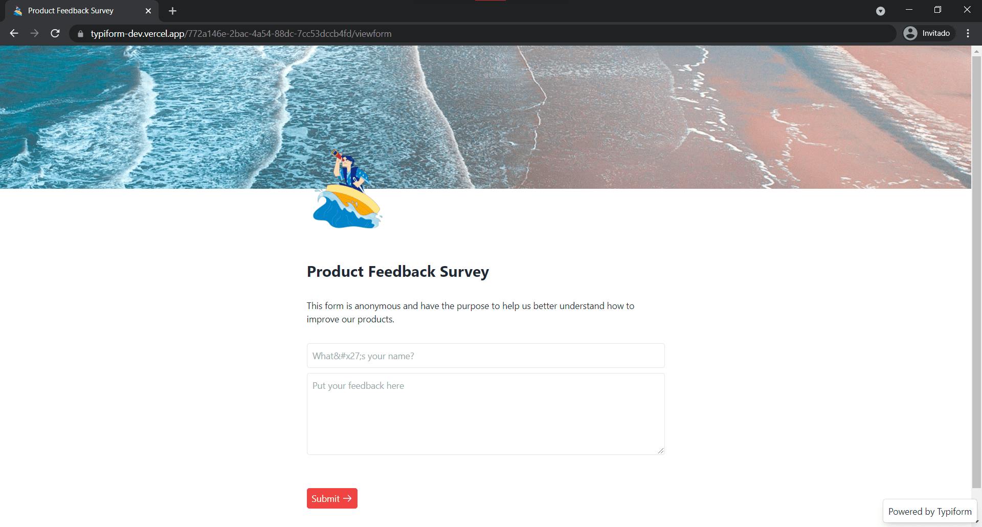
For this view, it's the same as the editor view, but here we render the element tag's instead of a div. We also register each of the form elements to manage the submission using react-hook-form, we store this data and send to the responses table. For now, each form element you add will have the required attribute.
SWR
SWR is a hooks library built by the team behind Next.js. SWR is a strategy to first return the data from cache (stale), then send the fetch request (revalidate), and finally come with the up-to-date data. Ilango Rajagopal authored a good article about it which you can read from here
This library was used to fetch form data from HarperDB and display it on your dashboard, form edit page, and the viewform page.
🔐Authentication with Auth0
For the authentication part, Auth0 comes with dozens of libraries for your preferred framework or language. As I went with Next.js, the right solution for me was the @auth0/nextjs-auth0 package, it was easy to implement authentication into my app using this package, all you have to do it's to follow Auth0's guide.
First, we need to signup for a Auth0 account or login if you have one. From there well get a Tenant instance which is we're all our auth data and applications is managed.
If we go to the Getting Started page, we'll see some options from where we can start to customize and integrate Auth0.
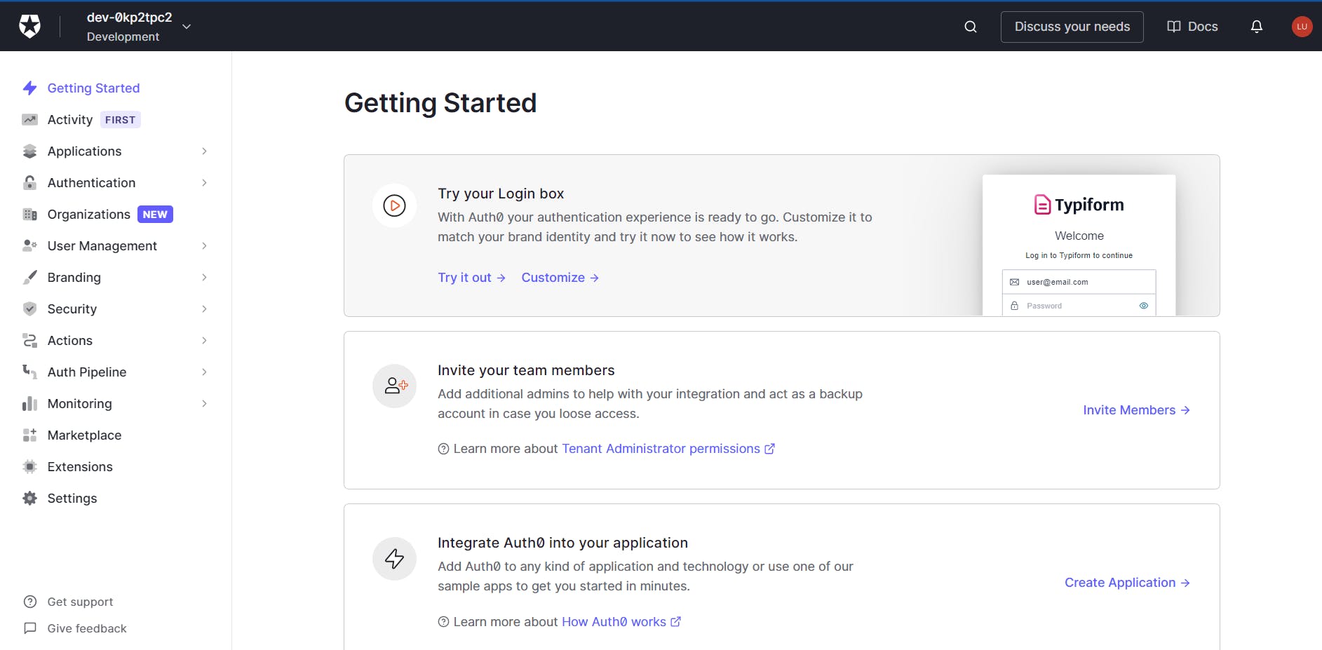
To add Auth0, let's move to Applications > Default App on our tenant dashboard, well change our Default app to a friendlier name and add a logo. For Next.js we also set the application type to Regular Web Application and we set the application URIs to point to our application URIs, if you're on a dev environment then you'll use localhost:300, and for production these changes to our production URI. The best part is that you don't have to change each URI when deploying to production or allowing both environments, you create more tenants and tag each to be for production, staging, and development.
From there we just need to follow the Auth0's Next.js guide. Let's summarize it.
- Install the package
npm install @auth0/nextjs-auth0 - Create a
.env.localfile and add your variables (if you're following the guide, these are already included in the snippet.AUTH0_SECRET='use node -e "console.log(crypto.randomBytes(32).toString('hex'))" to generate a random string' AUTH0_BASE_URL= AUTH0_ISSUER_BASE_URL= AUTH0_CLIENT_ID= AUTH0_CLIENT_SECRET= Add the auth handler to your api routes on
/pages/auth/[...auth0].js// pages/api/auth/[...auth0].js import { handleAuth } from '@auth0/nextjs-auth0'; export default handleAuth();Add the UserProvider component to your root
_app.js// pages/_app.js import React from 'react'; import { UserProvider } from '@auth0/nextjs-auth0'; export default function App({ Component, pageProps }) { return ( <UserProvider> <Component {...pageProps} /> </UserProvider> ); }
And you're done, to authenticate users just add a link to /api/auth/login and they'll be redirected to Auth0 for login. We can also set a returnTo URI by adding it as a query parameter at the end of the link, for example:
<a href="/api/auth/login?returnTo=/create">...</a>
This will forward the user once authenticated to our preferred destination.
Lastly, to check for a user session we can do it quite easy using the useUser hook:
import { useUser } from '@auth0/nextjs-auth0'

export default DashboardPage() {
  const { user, error, isLoading } = useUser()

  if (isLoading) return <p>Loading</p>
  if (error) return <p>Error</p>

  return <p>{user.name}</p>
}
The Auth0 Next.js SDK comes with more utilities such as handling authentication for API routes and external APIs. But you can check it all on their GitHub repo
So easy to add authentication to our apps, with just a few lines of code.
🚀 Roadmap
I still have some ideas for Typiform, I'm planning to improve the block's API and continue to upgrade the whole codebase. Here's a breakdown of the things I'm planning to add.
- More block elements with attribute customization, set if it's required or no, hidden blocks, etcetera.
- Checkboxes and radio elements.
- Conditional logic, to show a hidden section or element if a condition is meet.
- Collaborative features, invite more people to collaborate on a workspace.
- Better styling options and custom form elements.
- Choose a template when creating a new form.
Contributing ⭐
Feel free to contribute on GitHub or open an issue if you've found one.
Everything is under the MIT license, which you can check here.
Feedback 🔮
Of course, I have created a form for you to share your feedback about Typiform.
🌈 Demo
Go to Typiform and create your first form, you don't need to login or signup to do so.
- Source code: GITHUB REPO ↗
🙋♂️ Connect
You can find me anywhere as @fredoist or click somewhere below: